6 More Outdated Kitchen Design Features Worth Addressing in Your Remodel
Outdated Kitchen Design Features for 2023
I have 6 more outdated kitchen features that are worth addressing in your next remodel here, today.
I’m basing these suggestions on what clients and consultations have been asking to change in their kitchens over the last few years. I learn about trends in building and design from attending trade shows and constantly learning about products and materials, so this list is a result of all that experience.
Here are more outdated kitchen features with lots of examples, below. And if you haven’t seen the first 10 Outdated Kitchen Design Features, I have those linked at the bottom of this post. :-)
Desk in the kitchen
Caged-in kitchen
Cabinet hanging over open bar area
Soffit or furr down over upper cabinets
Microwaves in upper cabinets, hanging over countertops
Half-sheetrock wall / half-cabinet kitchen island
1) Desk in the kitchen
We are pulling these out and using this space for more dedicated cabinetry and better storage these days. Look at these images below! These spaces below are obviously not being used.
Now that we have laptops and devices, no one wants to sit in the kitchen in a cubby and stare at the wall. People would rather work at the kitchen table, perch at an island or just take it to the sofa. :-)
And yes, I’ve written a post about desks in a kitchen a few years ago too, if you want more before and afters.
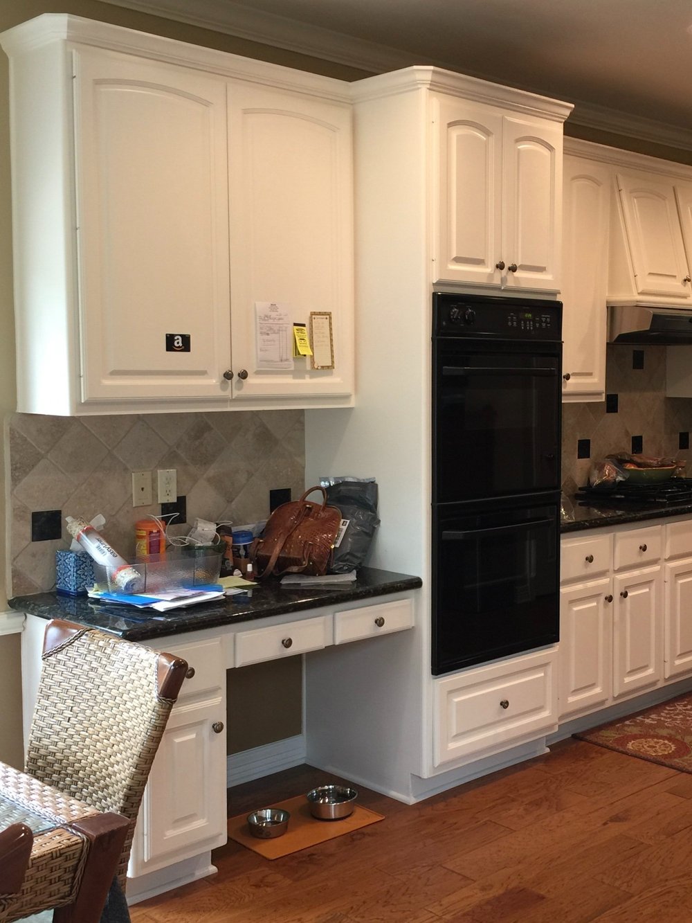
This kitchen was remodeled to have a small niche at the end of the cabinet run, to store the homeowner’s purse and cell phone charger, etc.
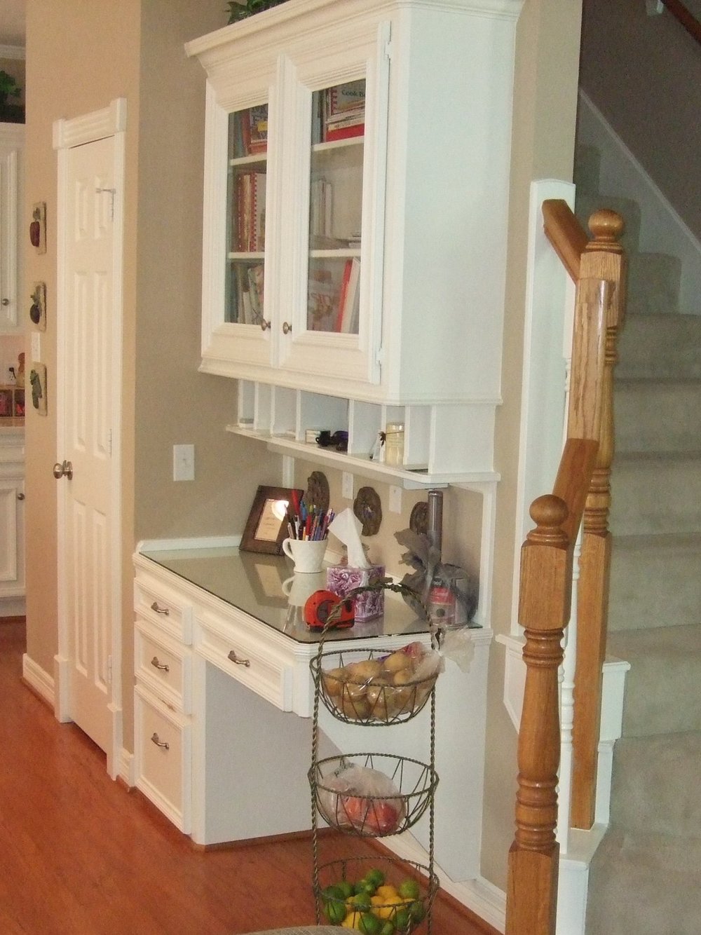
People don’t use desks in a kitchen much anymore.
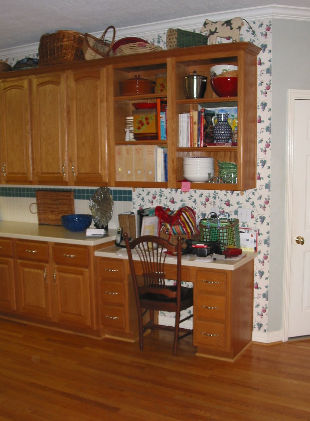
This little desk was changed out for a counter height dry bar/desk.
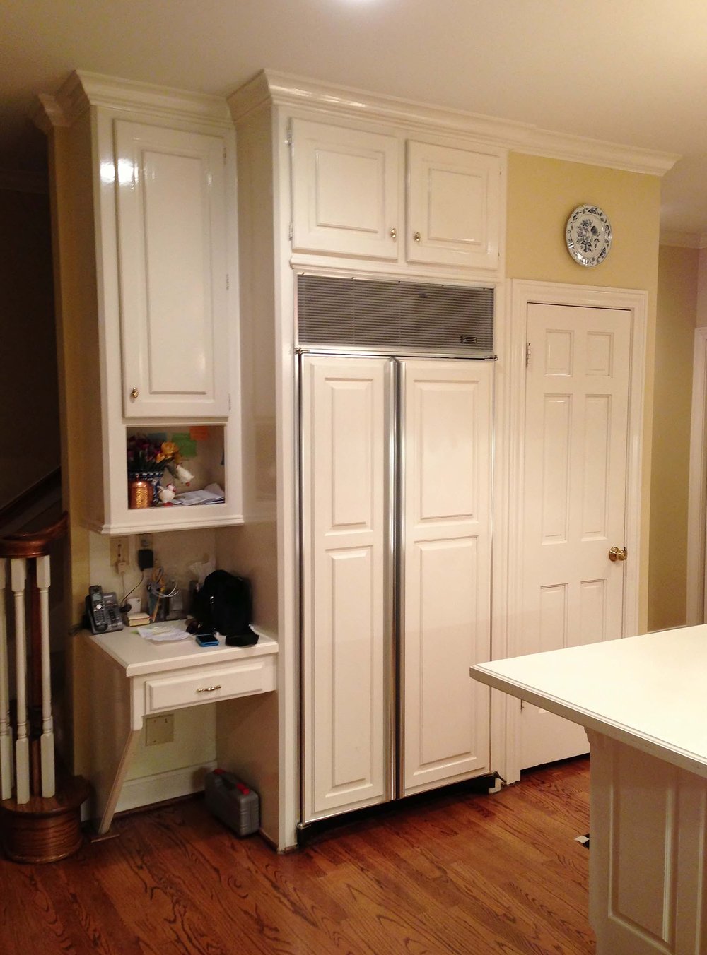
A tiny desk like this in a kitchen isn’t very useful these days. carlaaston.com
It always seems to me that these are more catch-alls for clutter than anything else.
2) Caged in Kitchen
This is a major expense, of course, to make structural changes, but people don’t like feeling enclosed in their kitchens. Especially when it sort of looks like a cage. :-)
It’s shocking how often I see this. I don’t think it ever really appealed to anyone.
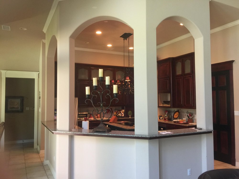
Caged in kitchens are worthy of addressing in a remodel.
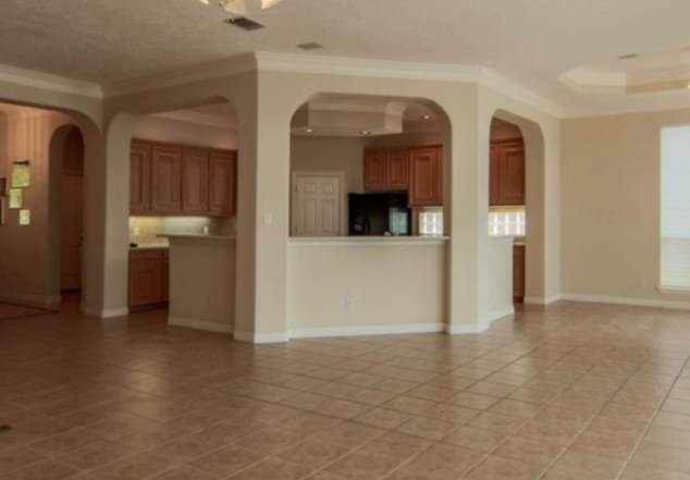
This kitchen will look so much more open and up to date without the caged in look these columns and arches add to the space.
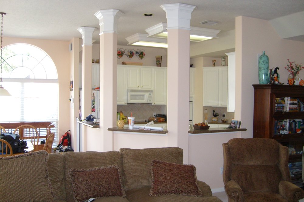
Lots of columns make for a “caged-in” look kitchen. Not a very current look for kitchens in 2023.
3) Cabinet hanging over open bar area
This is really an old trend, I had one in my old kitchen in Dallas about 25 years ago and it was ripped down before we moved back then. I did see one most recently in a custom home here in my area about 2 years ago, so they are still around.
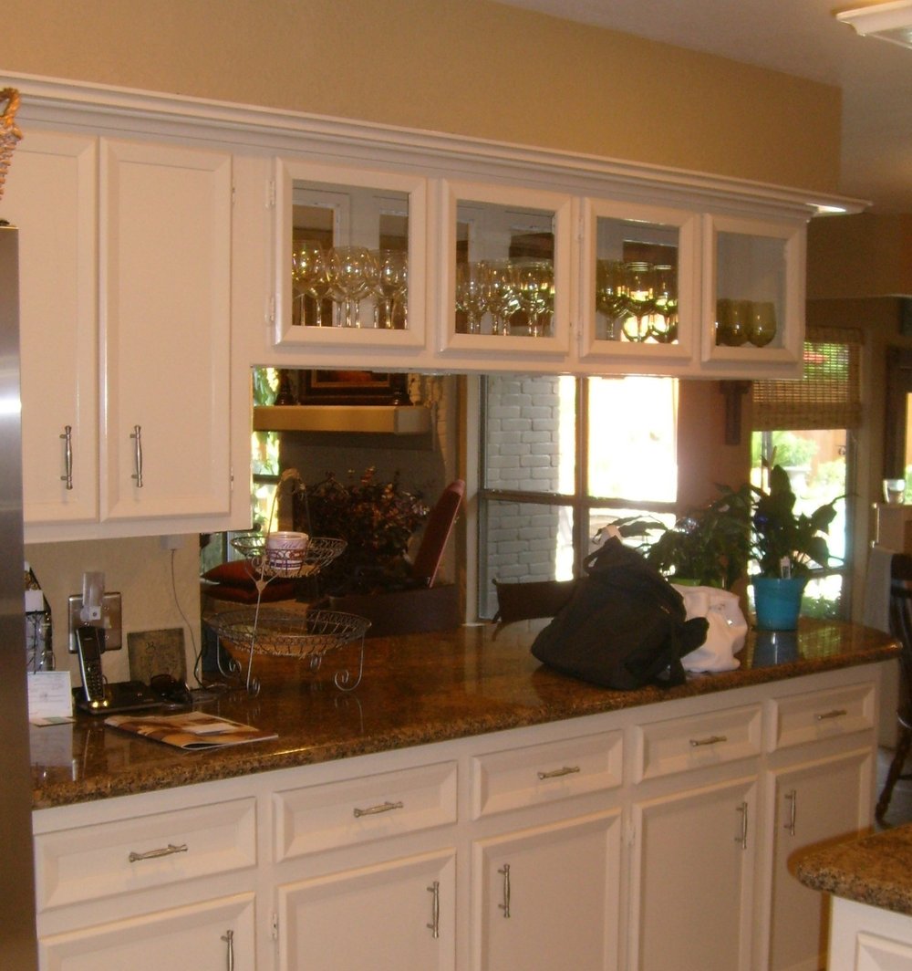
If you have a short cabinet hanging over your bar or peninsula, you might want to consider removing it in your next remodel.
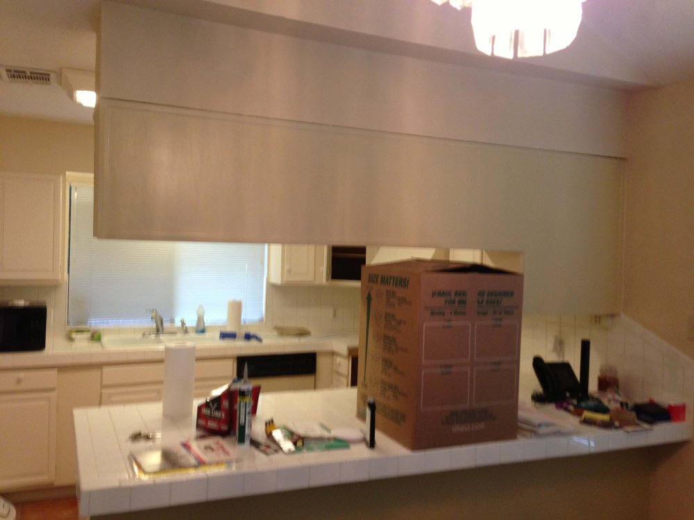
BEFORE - This soffit and upper cabinet blocked off the kitchen and felt confining.
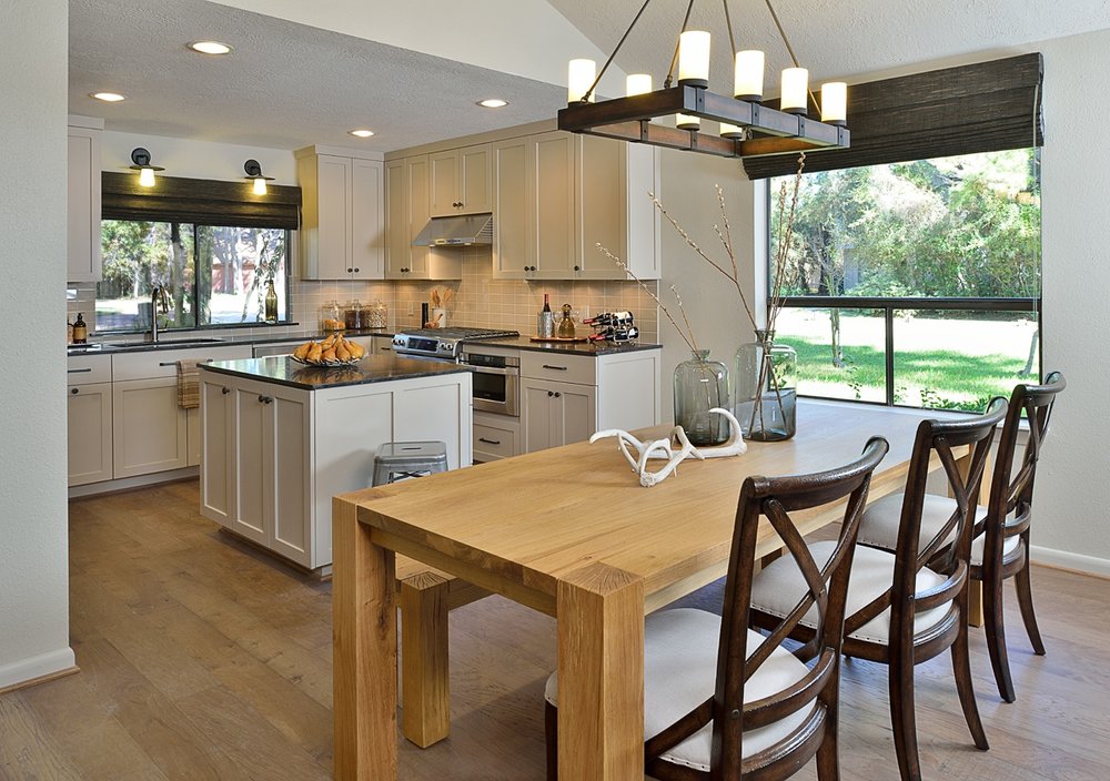
AFTER - This kitchen is more open with the removal of both peninsula and the low hanging upper cabinetry. carlaaston.com
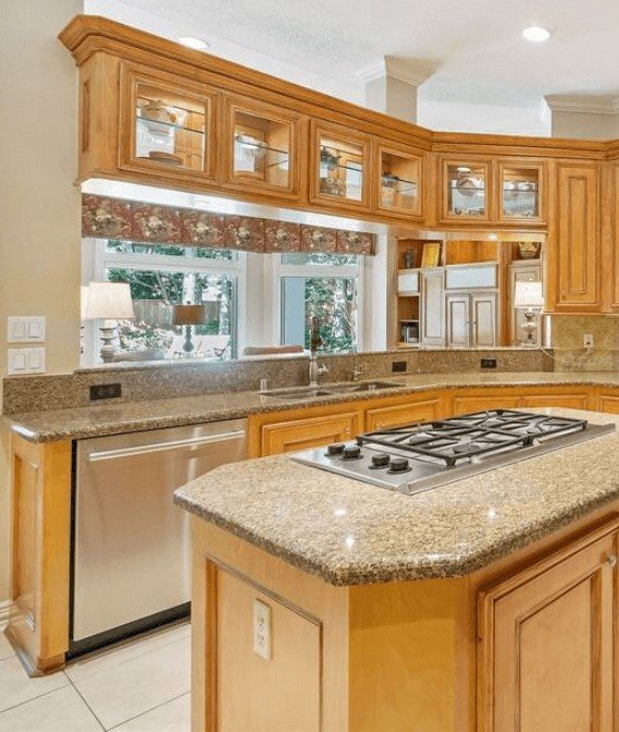
BEFORE - The real estate photo of this kitchen with a hanging cabinet over the bar. The home buyer knew it had to go. carlaaston.com
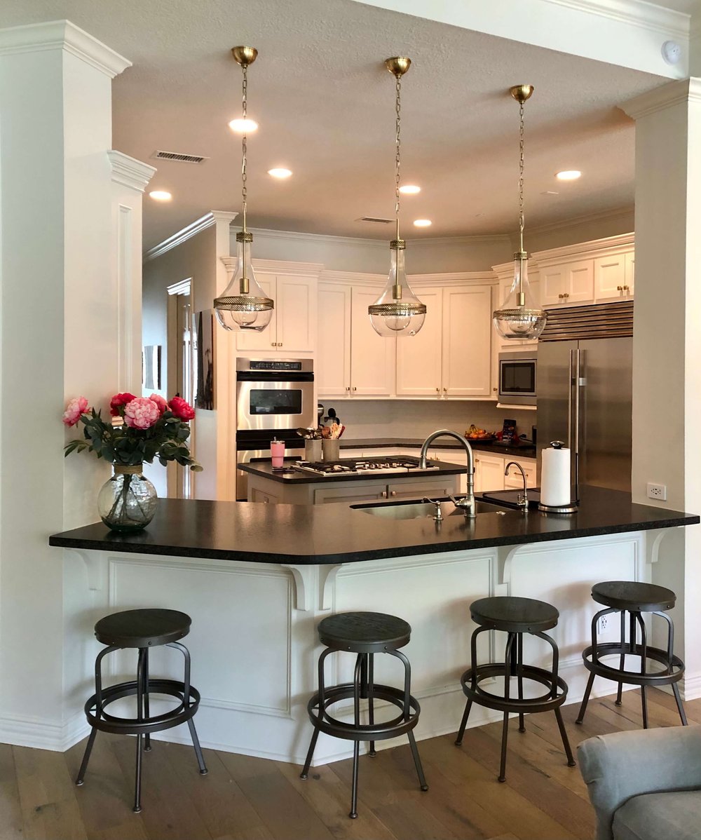
Removing that cabinet (along with paint and new counters, etc.) opened up this interior kitchen and made for a lighter, brighter space. carlaaston.com
4) Soffit or Furr Down above upper cabinets
This is typically also an older feature, but one I still see often. If you can tear out the soffit and take those cabinets to the ceiling…..how much more current and useful a kitchen that would be! :-)
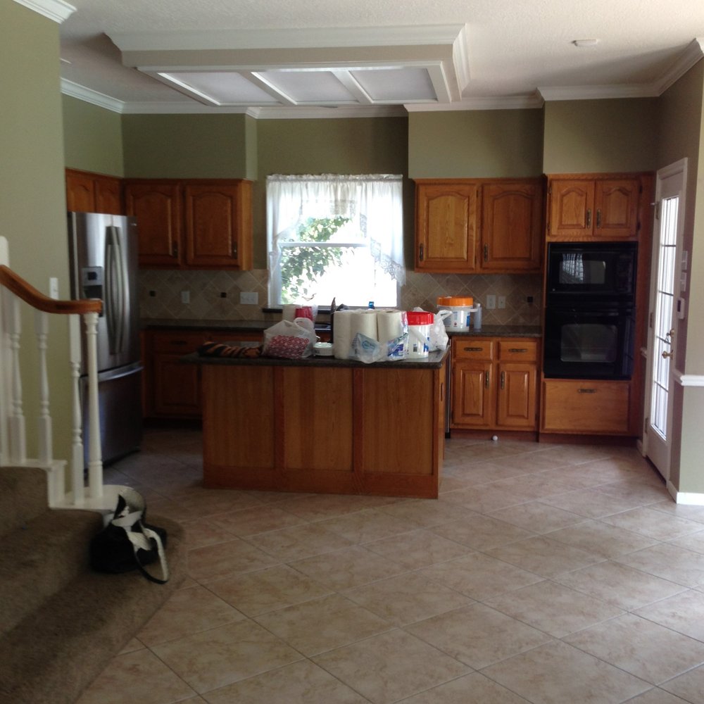
The design plan for this kitchen included removing the soffit and taking the cabinetry to the ceiling for a more upgraded look. carlaaston.com
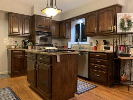
That furr down or soffit feels like it sort of squashes the upper cabinets. carlaaston.com
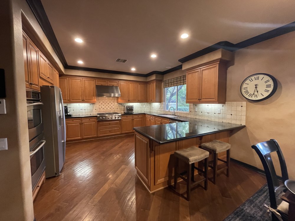
That’s a lot of furr down or soffit here in this kitchen. At the very least, I’d paint the trim to blend in to the wall and then totally remove that cabinet to the right of the window, along with the furr down there. Some open shelves would be nice there. carlaaston.com
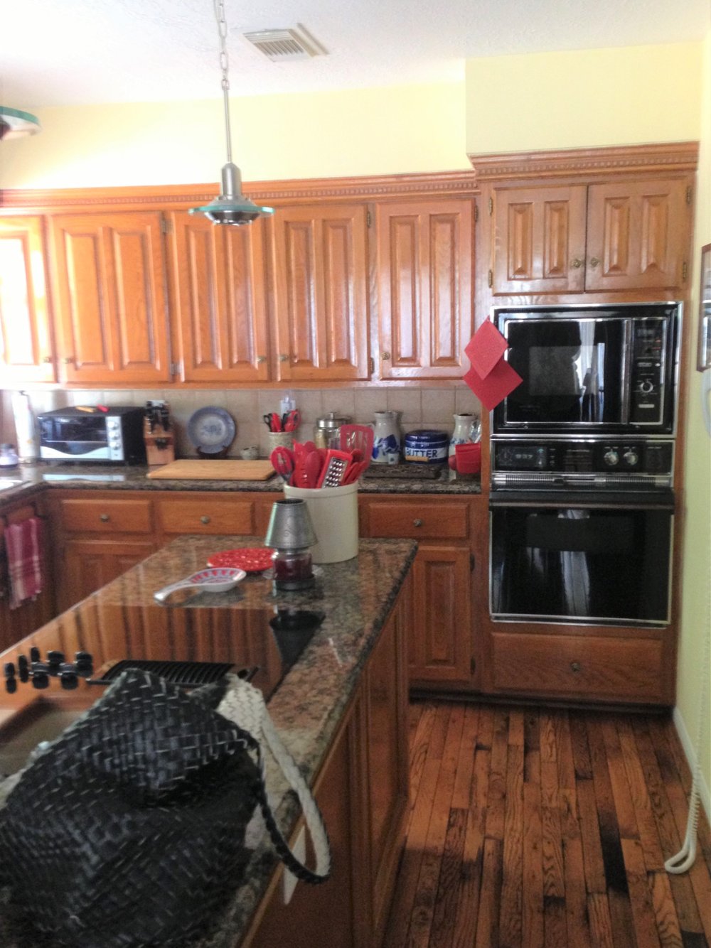
BEFORE - Since the ceiling height is only 8’ in this kitchen, removing the soffit was critical to get more storage in this kitchen. carlaaston.com
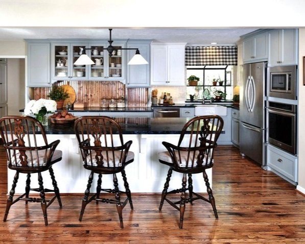
AFTER - Removing the soffit above the cabinets made much better use of the space in this kitchen. It added enough storage to counter the bit lost when we removed the wall between the kitchen and family room.
If cabinets are inset into a sheetrock area, purposely for a clean look, that’s different. But building a soffit to top the cabinets, like in these above, is an outdated look.
5) Microwaves in upper cabinets over cabinets
While these aren’t too bad looking, having a deep microwave in a cabinet that hangs over a countertop generally makes that counter pretty useless. Things get shoved under there and it is not a really good workable counterspace.
We are definitely using more drawer microwaves now, even when there are ovens in cabinets. Most people would rather have two ovens in a cabinet and put the microwave somewhere else than have an oven/microwave combo.
It can also completely omit the tall oven cabinet from the kitchen if you do a range with ovens in there. We often do that when we need more counterspace in a kitchen and the homeowner doesn’t mind a lower oven or wants a pro style range.
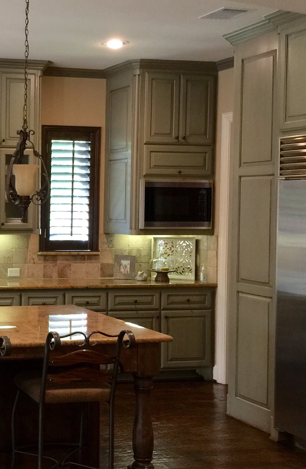
BEFORE - That’s a big chunky cabinet hanging there on the end of the counter, for the deep microwave.
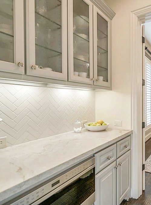
We ended up removing that deep microwave cabinet and placing in the adjacent butler’s pantry as an undercounter drawer model. carlaaston.com
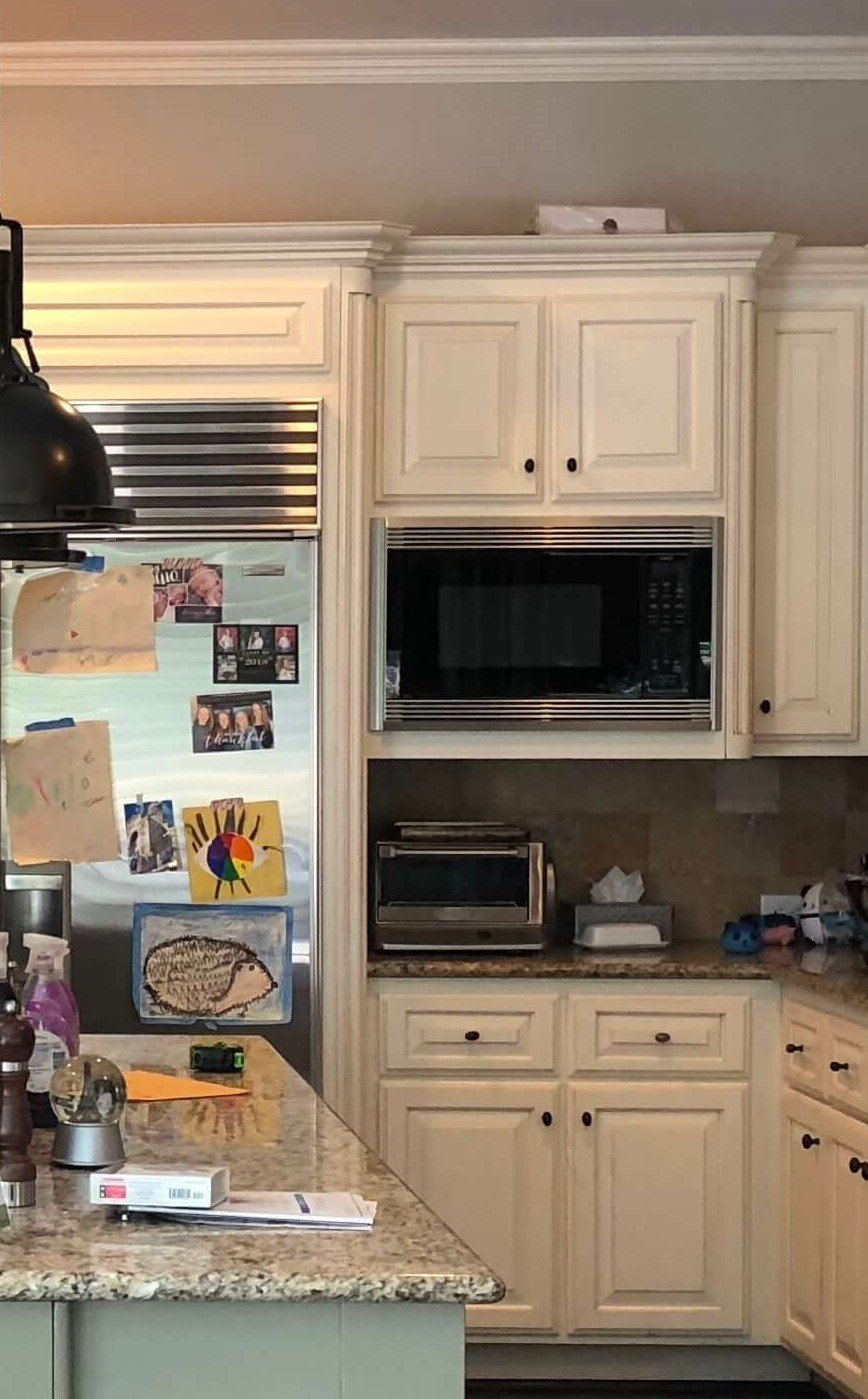
BEFORE - The deep microwave is a bit of an outdated kitchen feature these days.
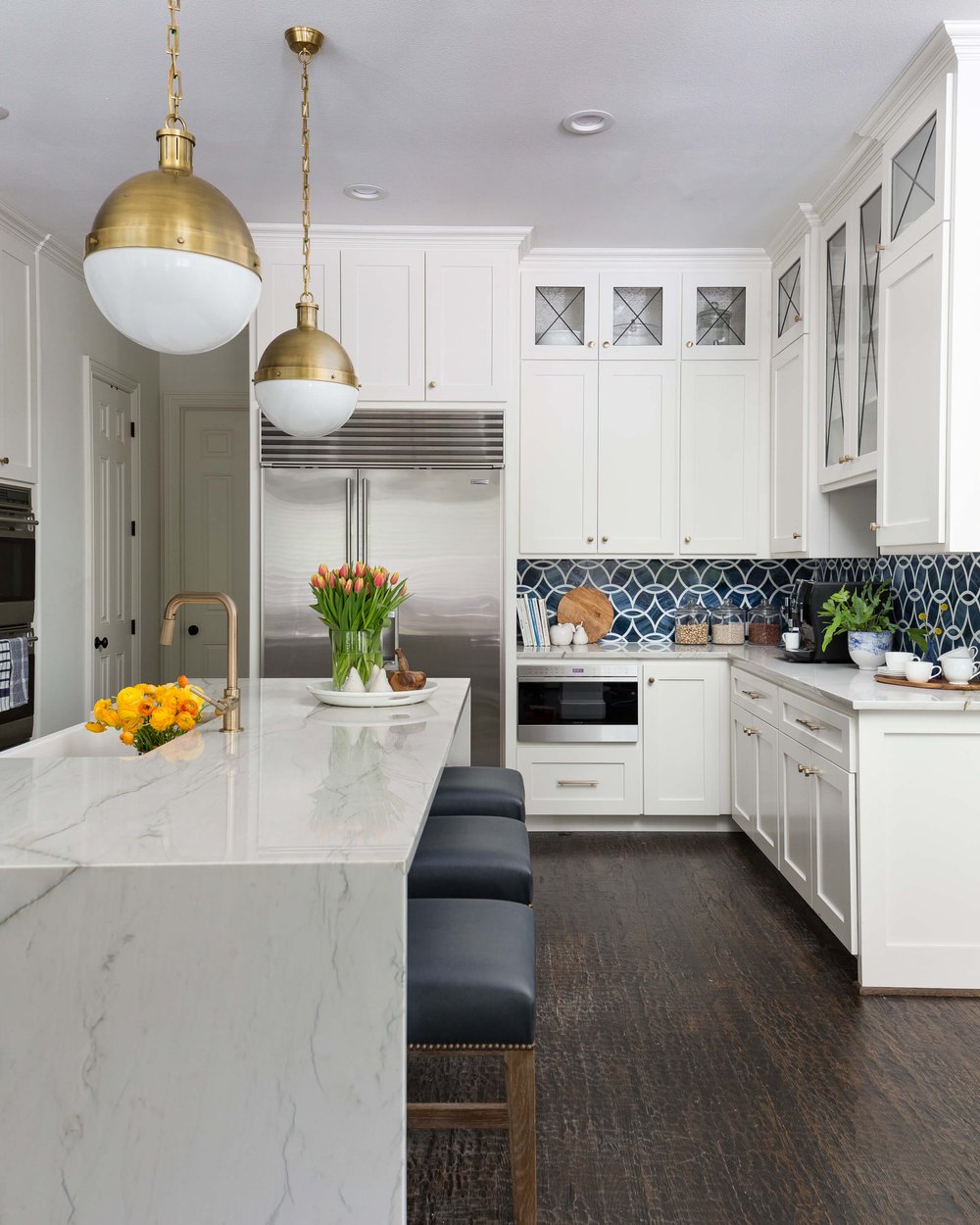
AFTER - Here’s how the undercounter microwave drawer looks in this remodeled kitchen. carlaaston.com
This client, below, didn’t cook, just heated things up now and then. He did not want two ovens and didn’t like the big microwave hanging over the countertop.
We did do a combo microwave and oven unit in the oven tower here, and just redid the upper cabinet for a simpler look above the countertop.
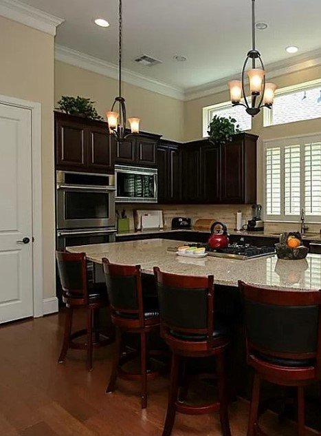
BEFORE - Microwave above the countertop
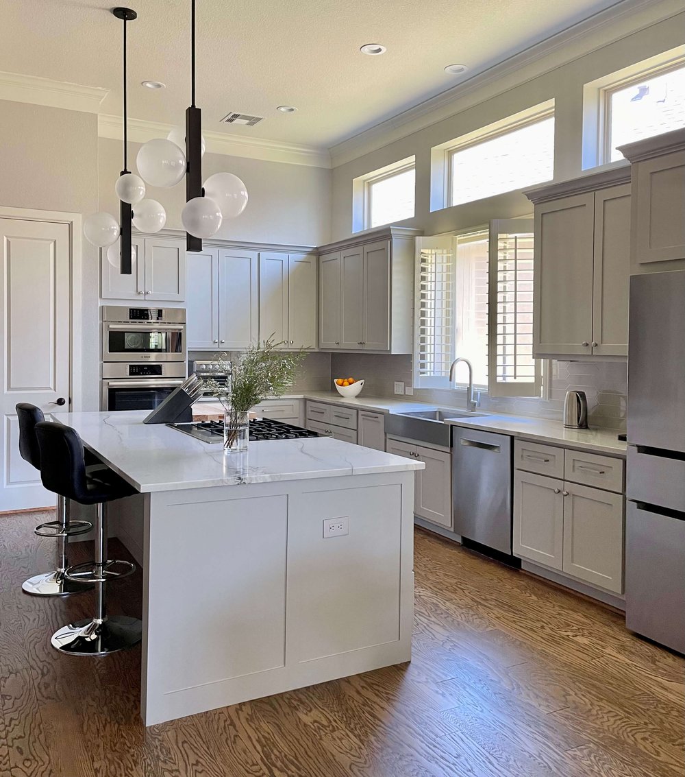
AFTER - A combination microwave and oven unit replaced the double oven for a homeowner that didn’t cook. The deep microwave sitting above the counter was removed for a cleaner look.
6) Half sheetrock wall, half cabinet island
This usually bugs me more than the homeowners, but the half sheetrock wall is such a cheap way to build an island. I’d always prefer it all to be clad in wood, not just a painted half wall.
One trick if you can’t pay to add wood panels to the face and sides, is to paint it the color of the cabinets. That helps it not stand out so much.
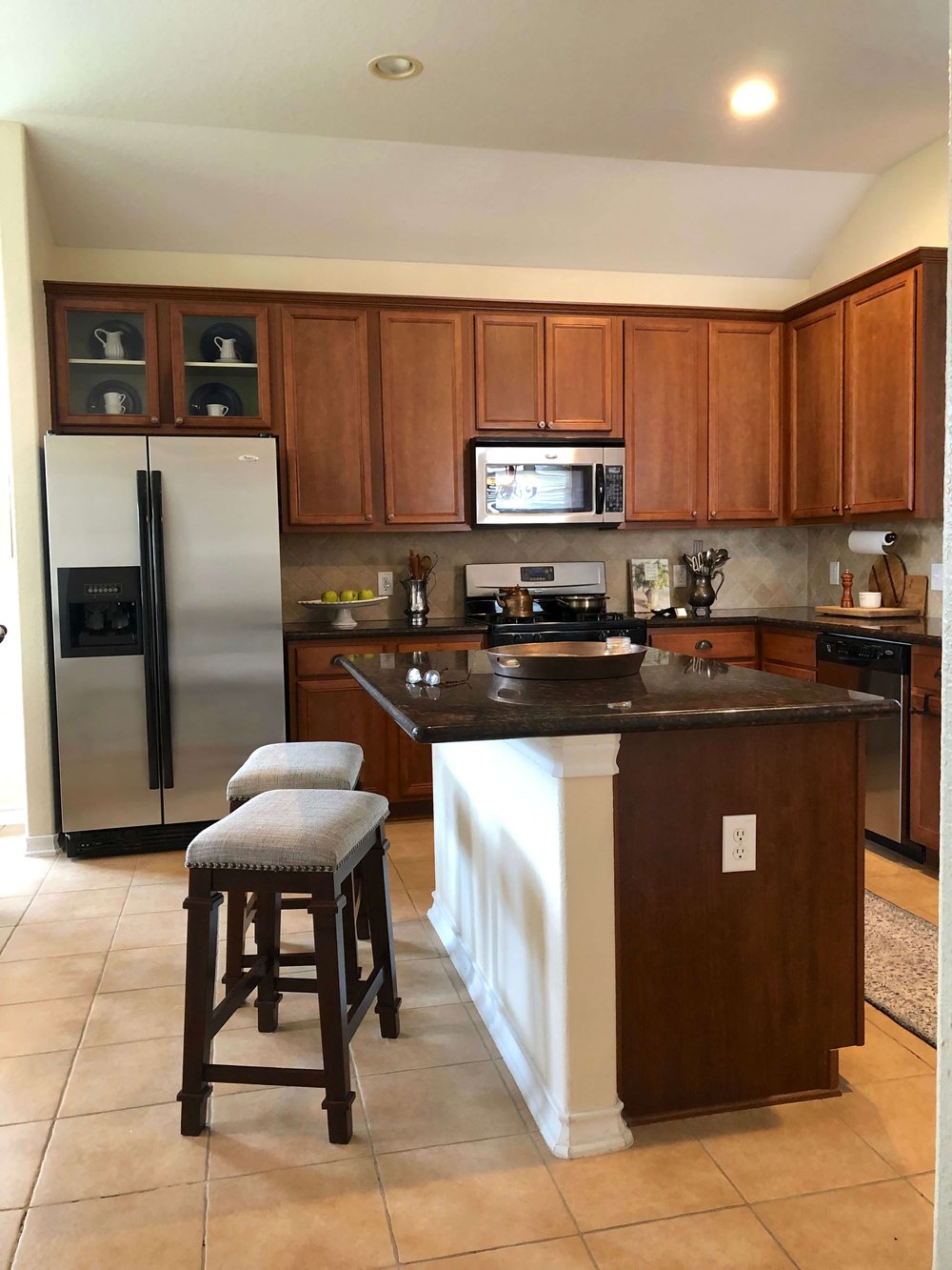
The half sheetrock wall, half cabinet island often falls short of the island really looking like an island or a piece of furniture, which is rather the idea of most kitchen islands.
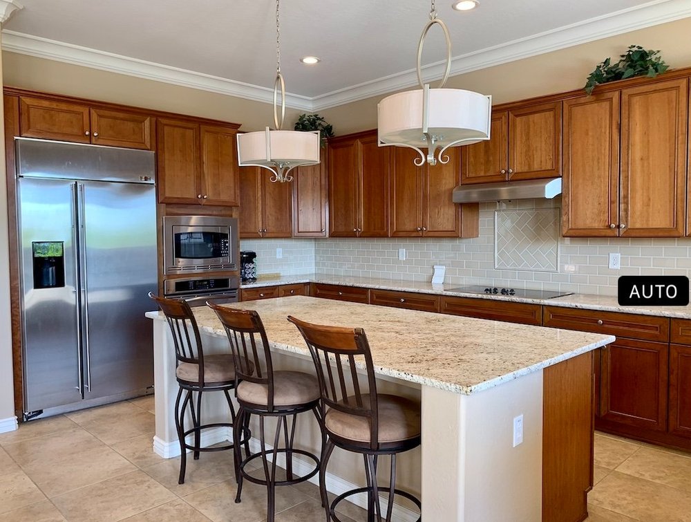
This consultation client had questions about possible upgrades for her kitchen. carlaaston.com
Here’s what I suggested for the situation above in this consultation, to clad the sides and face in wood panels and paint to match the cabinets (which they were going to paint anyway).
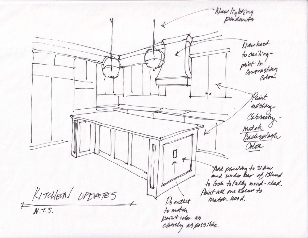
Design consultation for a partial kitchen remodel. carlaaston.com
I’m not forgetting one of the biggest considerations of all, cabinet color and finish. That deserves a post all by itself though. :-)
See my first post with 10 of those kitchen design features that seem to crop up first.
